From the Braindy archive · Food · Branding · 2021
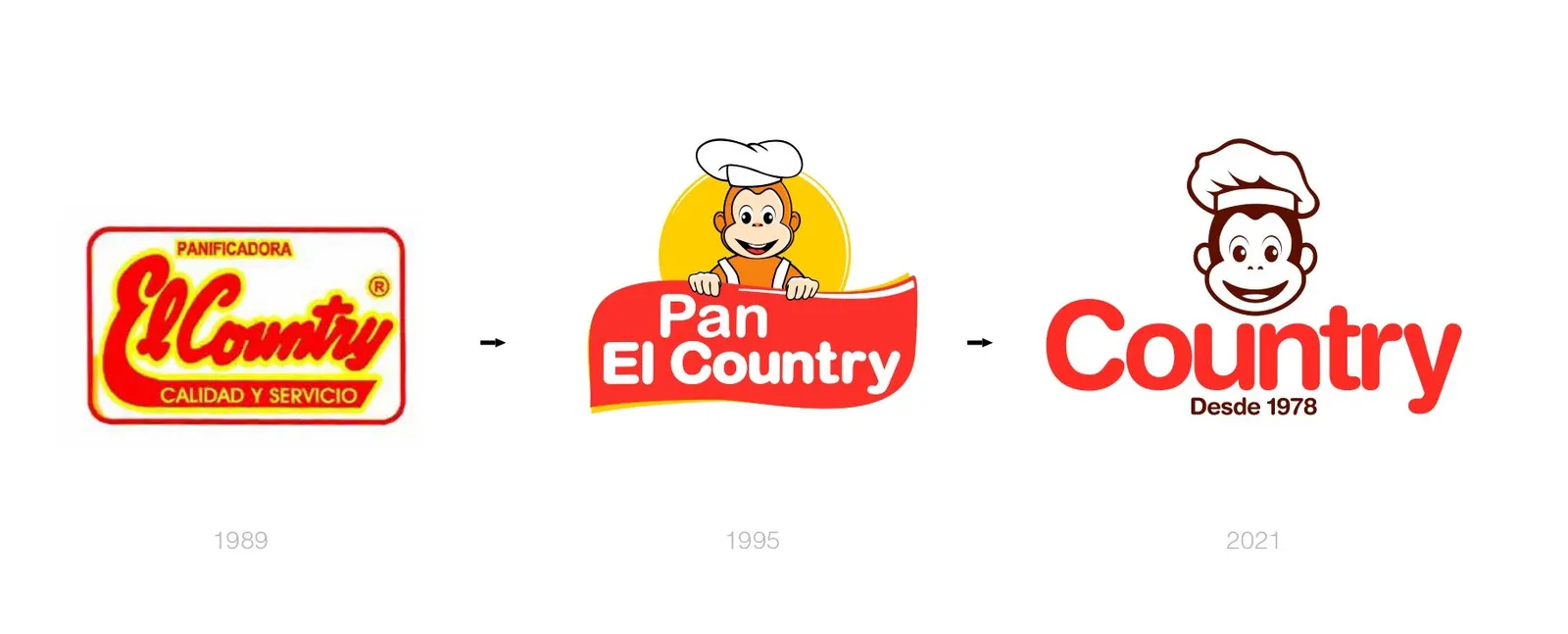
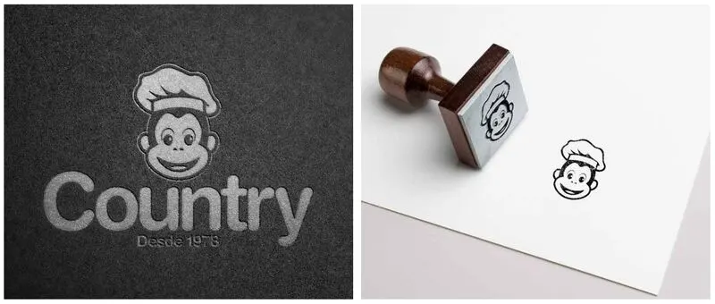
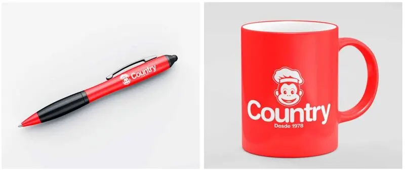
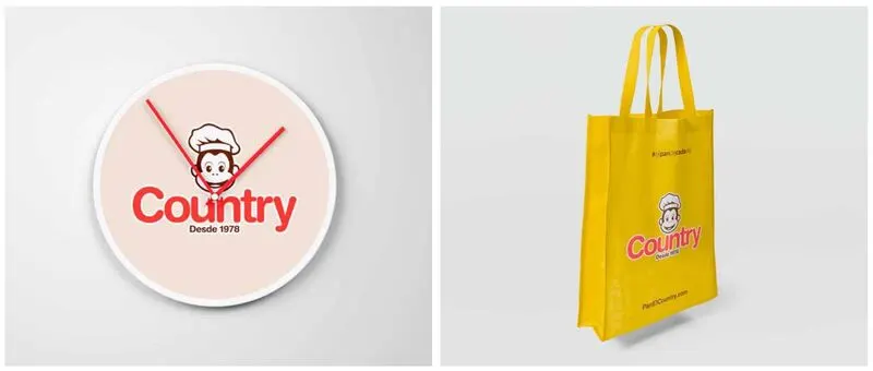
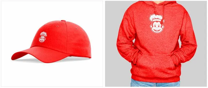
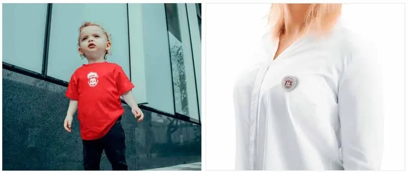
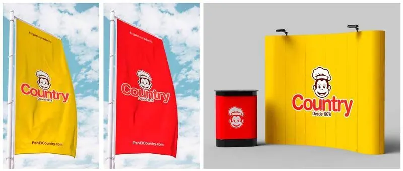
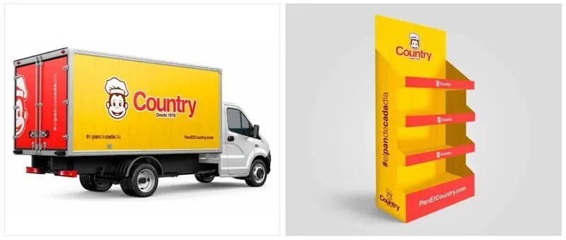
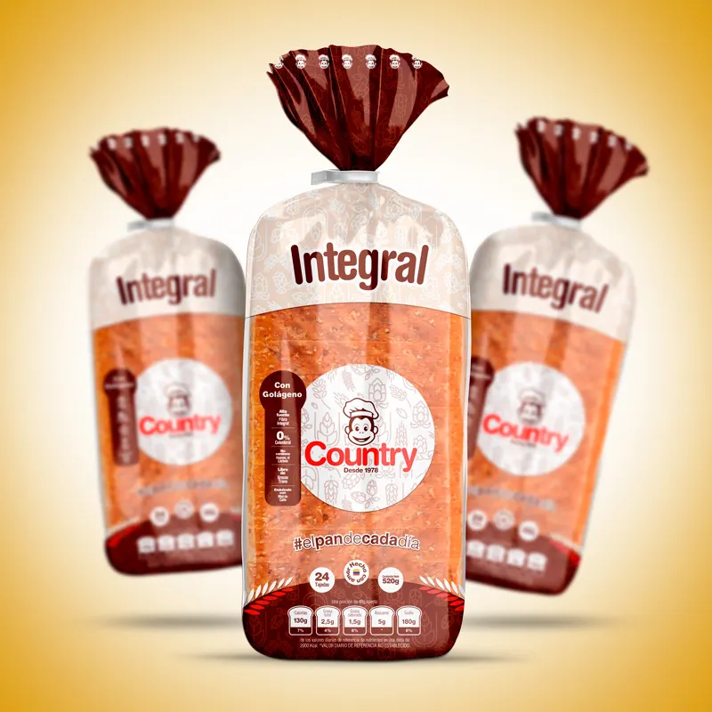
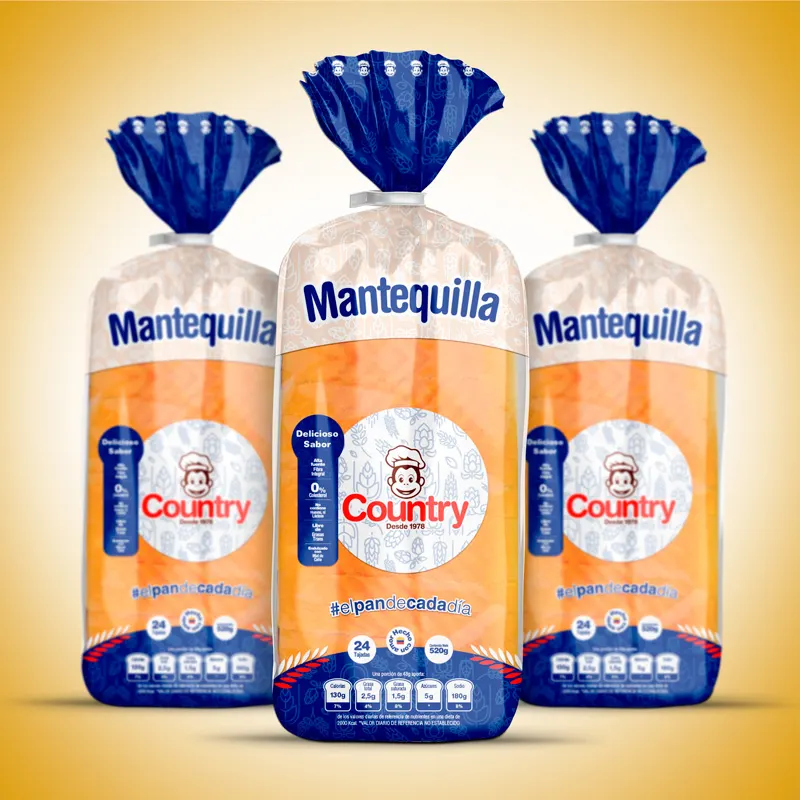
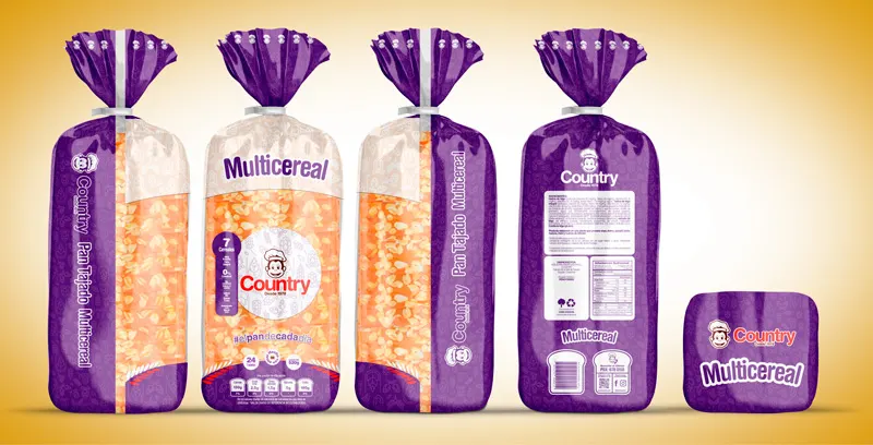
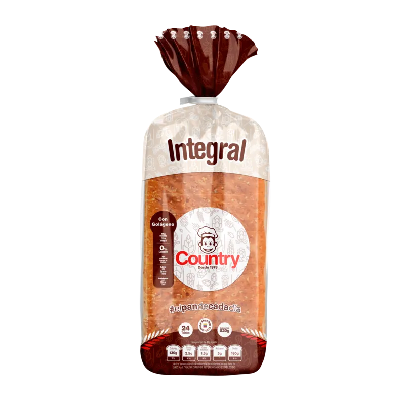
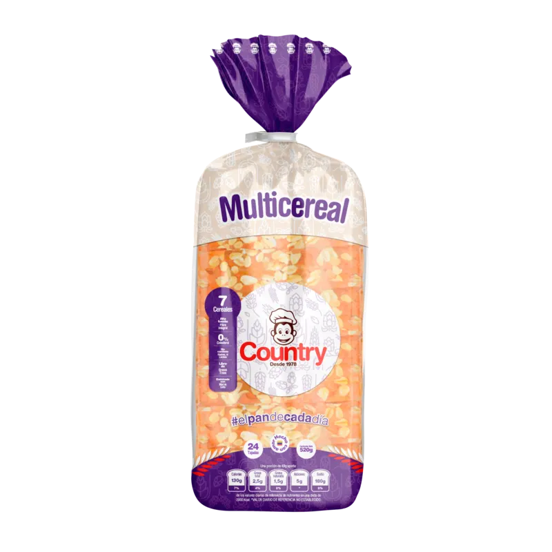
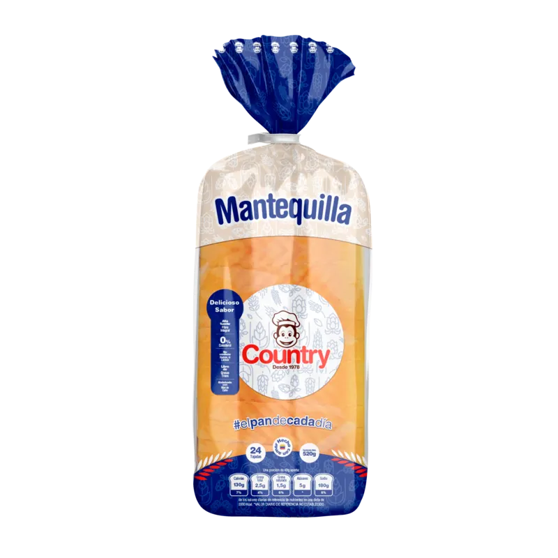
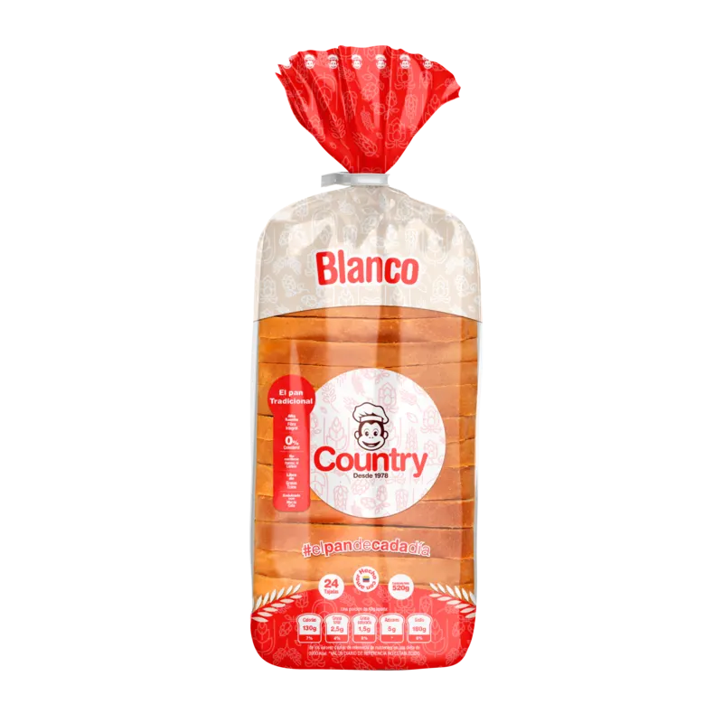
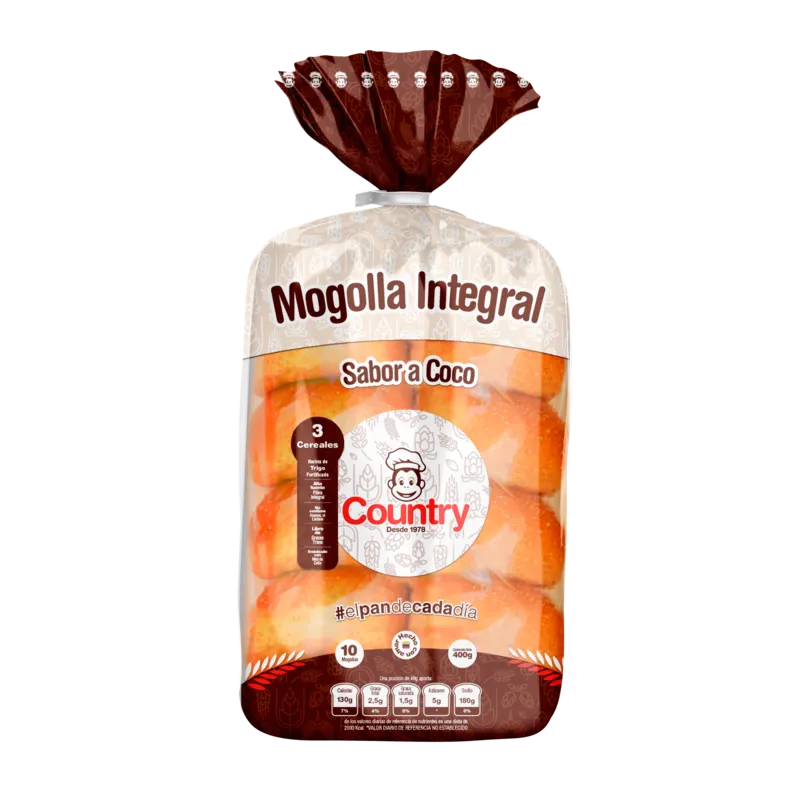
Pan El Country. We were tasked with the rebranding and the adaptation for the digital age while keeping their positioning in the local and national market.
The challenge
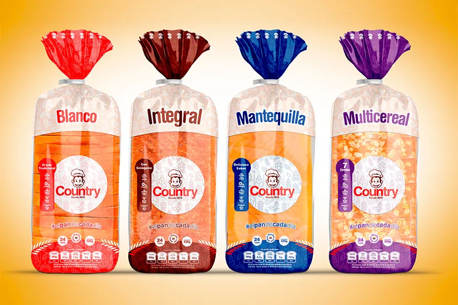
Seeking to reposition their bread brand on the TaT market (neighborhood stores) and Retail channel. They had the challenge of adapting its logo and identification system to the digital age without impairing its positioning and recognition in the local market. Their packaging should reflect their high quality standards and project the joy of their brand.
What we did
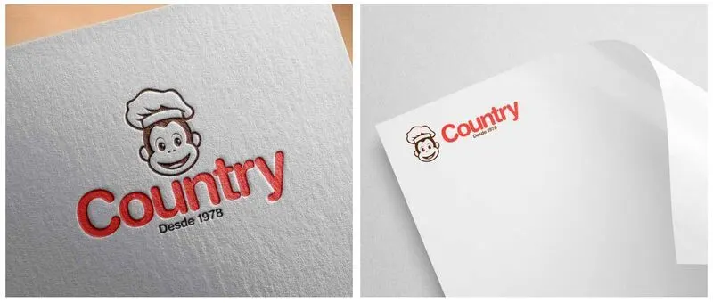
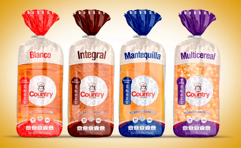
Logo redesign, identification system, name adjustment and packaging redesign. All with the purpose of creating a family of products that looks like they were made by the same brand and project aesthetic unity.
The result
Excellent reception of the internal client because of the result that projected the evolution of the company without leaving behind its tradition and its brand values.
Gallery · 20
More from the archive · Food
Next step
Let me build your Braintrust.
Tell me where your brand is today. We start with a strategy session. Questions first? Write or call me directly.
- nicolas@braindy.co
- +1 669 263 3378
- braindy.co · Silicon Valley, California