Marketing · · 5 min read
People decide with emotion and justify with reason
Feeling without proof feels empty, and proof without feeling goes unread. Design your brand and site to deliver both, in the right order.
 By Nicolas (NickMark)
Every brand meeting has the same argument. One side wants the work to feel something: a stronger image, a warmer voice, a story. The other side wants proof: numbers, features, the comparison table. Both are right, and the meeting usually ends with a compromise that does neither well. A site that tries to please both sides at once ends up moving nobody and convincing nobody.
The way out is not to pick a side. It is to understand the order in which people actually decide.
How do people actually make a choice?
People rarely reason their way into a choice from a blank slate. They feel a pull first, toward a brand, a product, a person, and then they look for reasons that confirm the pull. If the reasons are there, the decision holds. If not, the feeling fades and they move on.
You can see it in your own buying. You did not choose your favorite restaurant by comparing menus in a spreadsheet. Something felt right the first time. Later, when a friend asked why you go there, you had reasons ready: the service, the price, the location. The reasons were real, but they came second.
This changes what a brand and a website need to do. The question is not how much emotion versus how much reason. The question is sequence. Feeling first, proof right after. Not one instead of the other, and not both piled into the same sentence.
What the feeling is made of
Emotion in design is often reduced to color theory: blue for trust, green for calm. That is a small part of it, and the least reliable. The feeling comes from the whole impression, built from details that work together.
- Presence of people. Real faces, real teams, real clients. People respond to people far more than to objects or abstractions.
- Voice. The way your brand speaks in the first line. Calm and specific feels confident. Loud and generic feels like it needs to convince you.
- Space and rhythm. A page with room to breathe feels assured. A page where everything competes feels anxious.
- Care in the small moments. A button that responds, a form that thanks you, an error message that sounds human.
None of these is decoration. Together they answer a question the visitor never says out loud: do these people get me?
When does the visitor start asking for proof?
Once the visitor feels the pull, their reasoning mind wakes up and starts asking for justification. This is where many emotional brands fail. They built a beautiful mood and then offer nothing to hold on to.
Proof is specific or it is not proof. Named clients, measured results, a clear process, transparent next steps. Quimiolab, a medical diagnostics company and our brand partner since 2018, reports sales up 1,150% over the course of that partnership. Gimnasio Los Caobos, a school in Colombia, reports admissions up 613% after its new brand, digital ecosystem and site. Numbers like these work because they are concrete and attributed, and because they arrive after the reader already wants them to be true.
Proof also includes the boring parts: what it costs, how long it takes, who does what. Clarity is a form of respect, and the reasoning visitor reads it as one.
The brain that smiles
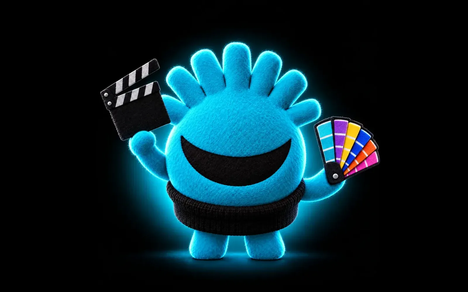
At Braindy we use a simple image for this: a brain that smiles. Structure plus emotion. The brain is the strategy, the order, the evidence. The smile is what makes someone want to stay long enough to see it. A brand that is only brain feels cold and gets compared on price. A brand that is only smile feels pleasant and gets forgotten.
In practice, that means every key page has two jobs in a fixed order. The top of the page earns the feeling. The next scroll earns the trust. Our own line puts it plainly: what doesn't move people isn't remembered. And what is remembered but cannot be justified does not get bought.
How do you design for both feeling and proof?
Use these questions on your homepage, your main service page and your most important campaign. They will tell you which side you are missing.
- What does a visitor feel before reading? If you cannot name the feeling in one word, there is none.
- Is the feeling honestly yours? A mood borrowed from a competitor or a template will feel familiar, not memorable.
- Where does the first proof appear? It should sit within the next scroll after the promise, not buried at the bottom.
- Is the proof specific? Names, results and steps, not adjectives like leading, innovative or trusted.
- Does the proof match the feeling? A warm, human opening followed by a cold wall of specs breaks the spell.
- Is there a clear next step after the proof? The moment the reasons click is the moment to ask.
Where does emotional design advice go wrong?
You have probably seen confident claims that a precise share of every purchase is driven by emotion, or that trust forms in a fixed number of milliseconds. They are repeated so often that they feel like facts. You do not need them. The pattern is visible in your own customers, and building on an invented statistic undermines the very trust you are trying to earn.
The other mistake is treating emotion as a lever to pull. Fake urgency, manufactured scarcity, guilt in the button copy. That is pressure, not feeling. It may produce a click. It also produces the regret that makes people leave bad reviews and never come back. Real emotion in a brand is closer to recognition: the sense that this place was made for someone like me.
And the opposite failure deserves the same honesty. Some brands, especially in technical or B2B categories, decide emotion is not for them. Their buyers are rational, they say. Their buyers are also people. A procurement lead still has to feel confident enough to put their name on the choice.
How do you end the argument in the meeting?
The next time the room splits between the people who want feeling and the people who want proof, you do not need a compromise. You need an order. Give the feeling first, so people want to keep going. Give the proof right after, so they can say yes with a clear conscience. Both sides were right all along. They were just arguing about which comes first.
If you want to see how that order could work for your brand, talk to Nicolas.